Back to Blog

Everything You Need to Know About the Latest Starred UI Update

We've recently introduced a major User Interface (UI) update , alongside minor interaction improvements throughout the Starred Analytics Platform. These changes will make it even easier for you to effortlessly analyze your insights.

What’s Changing?

Please note that this change only applies to the “Analytics” and “General Settings” part of the platform, such as dashboards, account settings and company settings. We are not changing any of the candidate-facing elements, such as the survey builder or the surveys themselves.

All your data will, of course, remain unchanged.

An improved look and feel

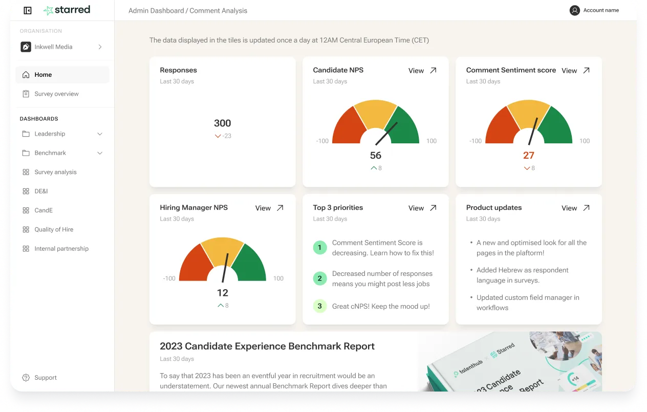
The color-schemes in the Analytics Platform have been changed to match our new brand identity.
Changes to navigation

  • A completely collapsible side-bar (use the icon in the top left corner to collapse and expand the menu)
  • Page breadcrumbs in the top navigation bar to know exactly where you are in your platform journey
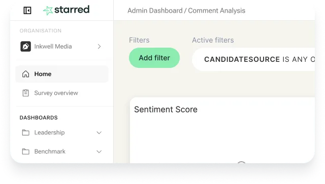
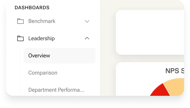
  • The double-sided menu has been replaced by collapsible folders, housing the different dashboard elements. Contrary to what you’re used to, clicking on the folder will only expand the folder, allowing you to access the dashboard you’re looking for directly from the navigation bar.
  • You can recognize folders versus other dashboard items by the folder icon.
Company Settings and Account Settings have been separated

  • Company Settings (including Survey Settings) can be found exactly where they were before, by hovering over your company name in the left navigation bar.
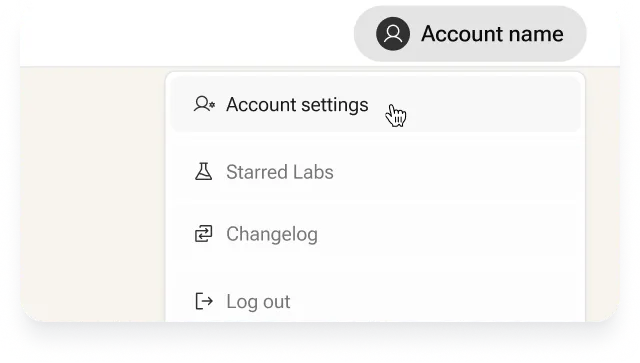
  • Now, you will be able to access Account Settings by clicking your name in the top right corner.
The Integrations tab has been moved to Company Settings

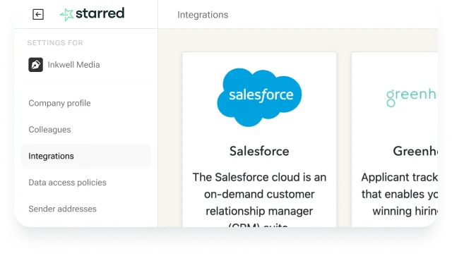
We have moved the “Integrations” tab to Company Settings to prevent any accidental changes to the existing integration with your ATS. To access Integrations, hover over your company name in the top left corner, go to Company Settings and find the “Integrations” tab in the left navigation bar.
Additional changes to keep in mind

  • The “Surveys” tab has been renamed to “Survey Overview”. You can find it in the same place as before.
  • The survey categories in “Survey Overview” are now set to display collapsed by default. This will allow you to stay more focused on the surveys you are working on.
  • The “Support” tab has been moved directly to the left navigation bar to ensure easy access by all users.

Now you’re prepared for when the UI update goes live. If you have any questions or experience any bugs or inconsistencies, please reach out to your Customer Success Manager.

Back to Blog
Article quick links

Everything You Need to Know About the Latest Starred UI Update

Details

We've recently introduced a major User Interface (UI) update , alongside minor interaction improvements throughout the Starred Analytics Platform. These changes will make it even easier for you to effortlessly analyze your insights.

What’s Changing?

Please note that this change only applies to the “Analytics” and “General Settings” part of the platform, such as dashboards, account settings and company settings. We are not changing any of the candidate-facing elements, such as the survey builder or the surveys themselves.

All your data will, of course, remain unchanged.

An improved look and feel

The color-schemes in the Analytics Platform have been changed to match our new brand identity.

Changes to navigation

  • A completely collapsible side-bar (use the icon in the top left corner to collapse and expand the menu)
  • Page breadcrumbs in the top navigation bar to know exactly where you are in your platform journey

  • The double-sided menu has been replaced by collapsible folders, housing the different dashboard elements. Contrary to what you’re used to, clicking on the folder will only expand the folder, allowing you to access the dashboard you’re looking for directly from the navigation bar.
  • You can recognize folders versus other dashboard items by the folder icon.

Company Settings and Account Settings have been separated

  • Company Settings (including Survey Settings) can be found exactly where they were before, by hovering over your company name in the left navigation bar.
  • Now, you will be able to access Account Settings by clicking your name in the top right corner.

The Integrations tab has been moved to Company Settings

We have moved the “Integrations” tab to Company Settings to prevent any accidental changes to the existing integration with your ATS. To access Integrations, hover over your company name in the top left corner, go to Company Settings and find the “Integrations” tab in the left navigation bar.

Additional changes to keep in mind

  • The “Surveys” tab has been renamed to “Survey Overview”. You can find it in the same place as before.
  • The survey categories in “Survey Overview” are now set to display collapsed by default. This will allow you to stay more focused on the surveys you are working on.
  • The “Support” tab has been moved directly to the left navigation bar to ensure easy access by all users.

Now you’re prepared for when the UI update goes live. If you have any questions or experience any bugs or inconsistencies, please reach out to your Customer Success Manager.

Hiring success tips right in your inbox

Want to find out more? Speak to one of our Hiring Experience experts!